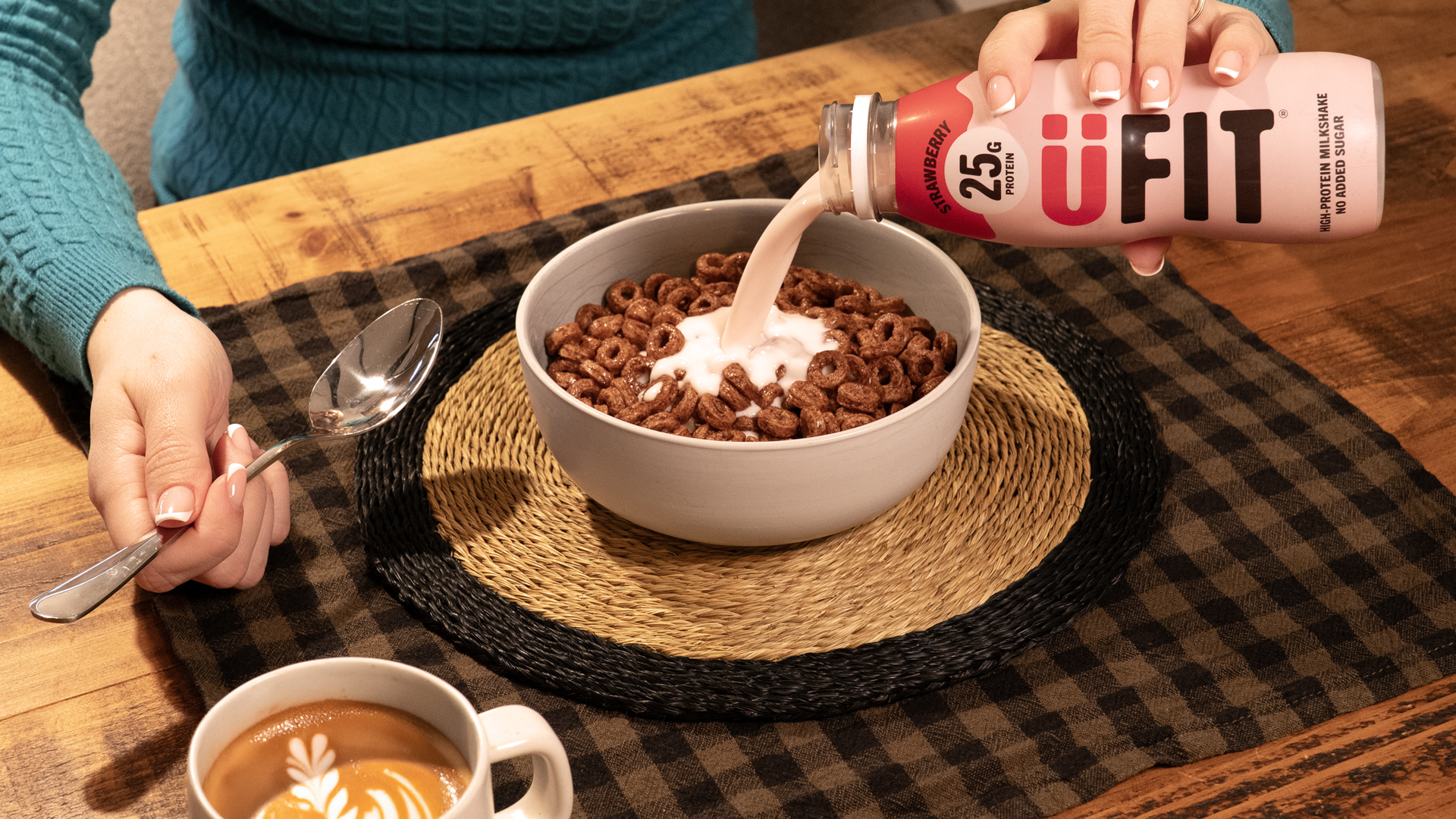
Bold moves at breakfast.
Packaging, photography
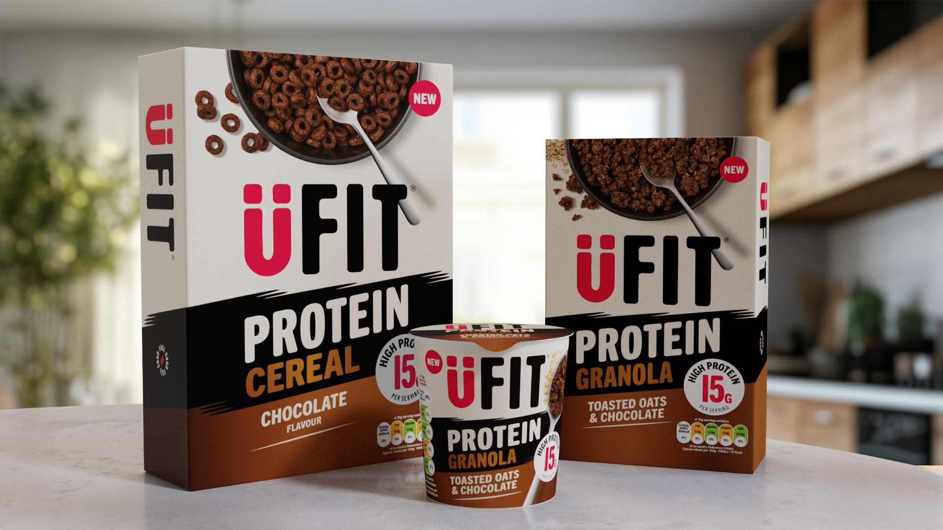
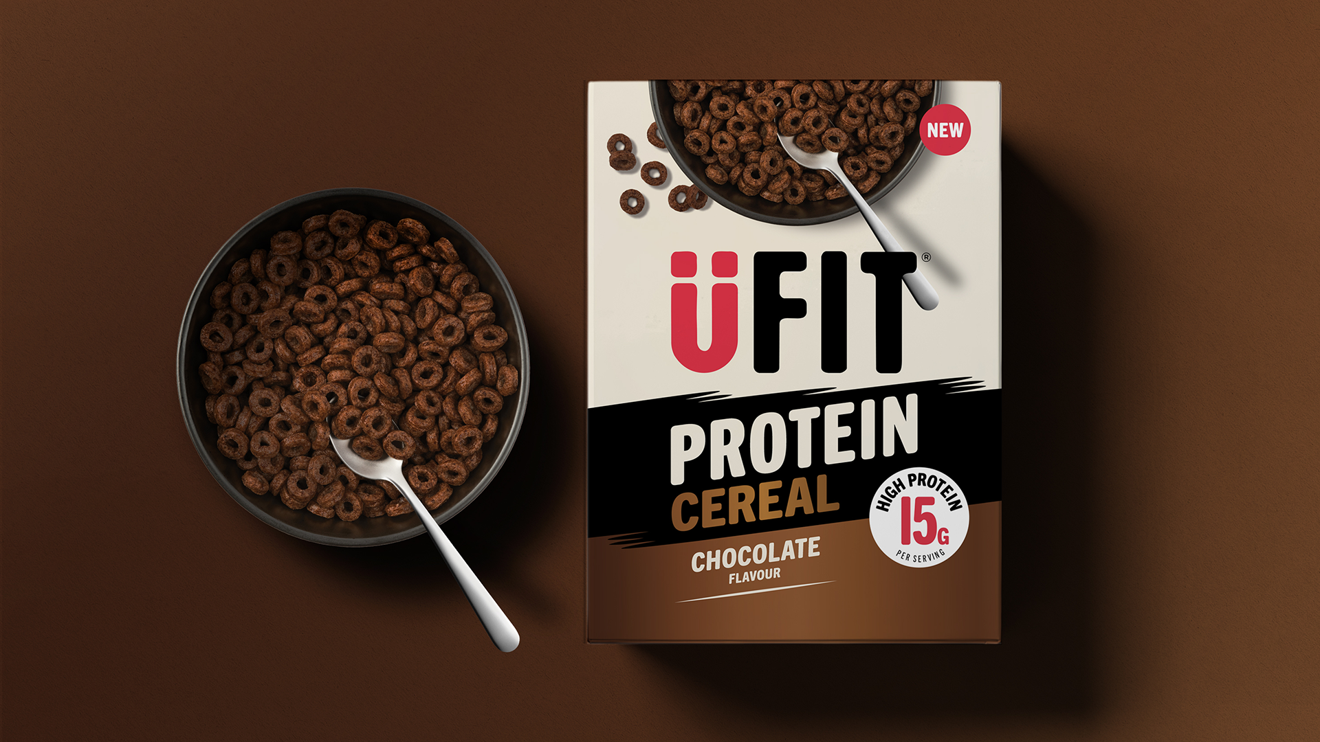
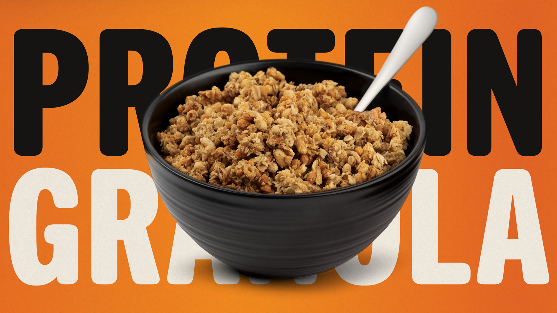
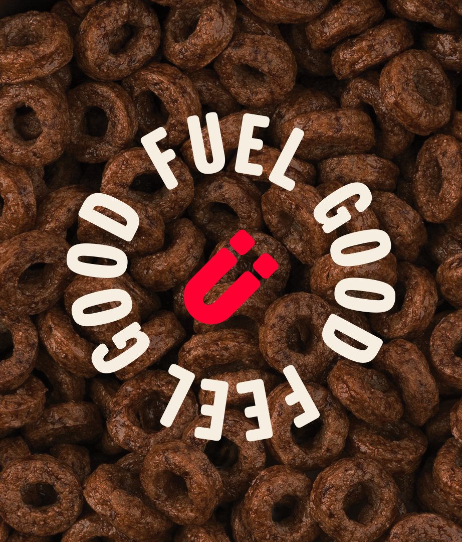
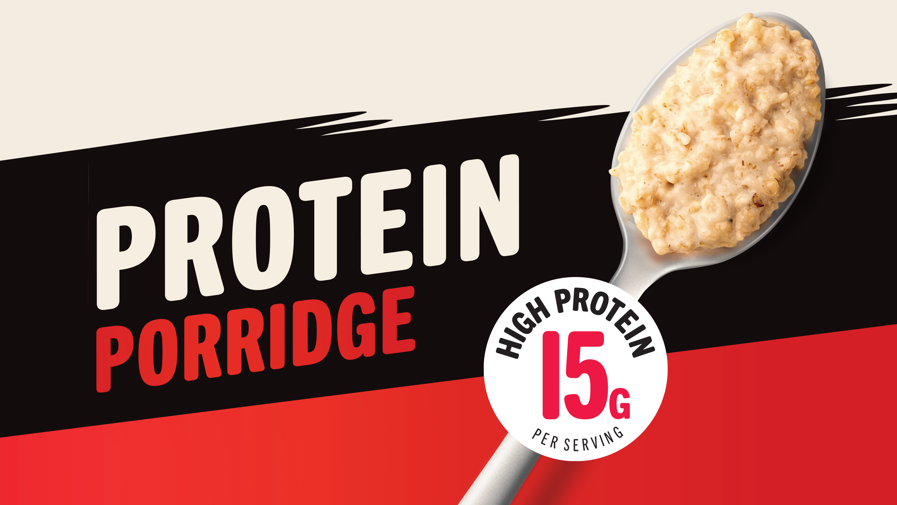
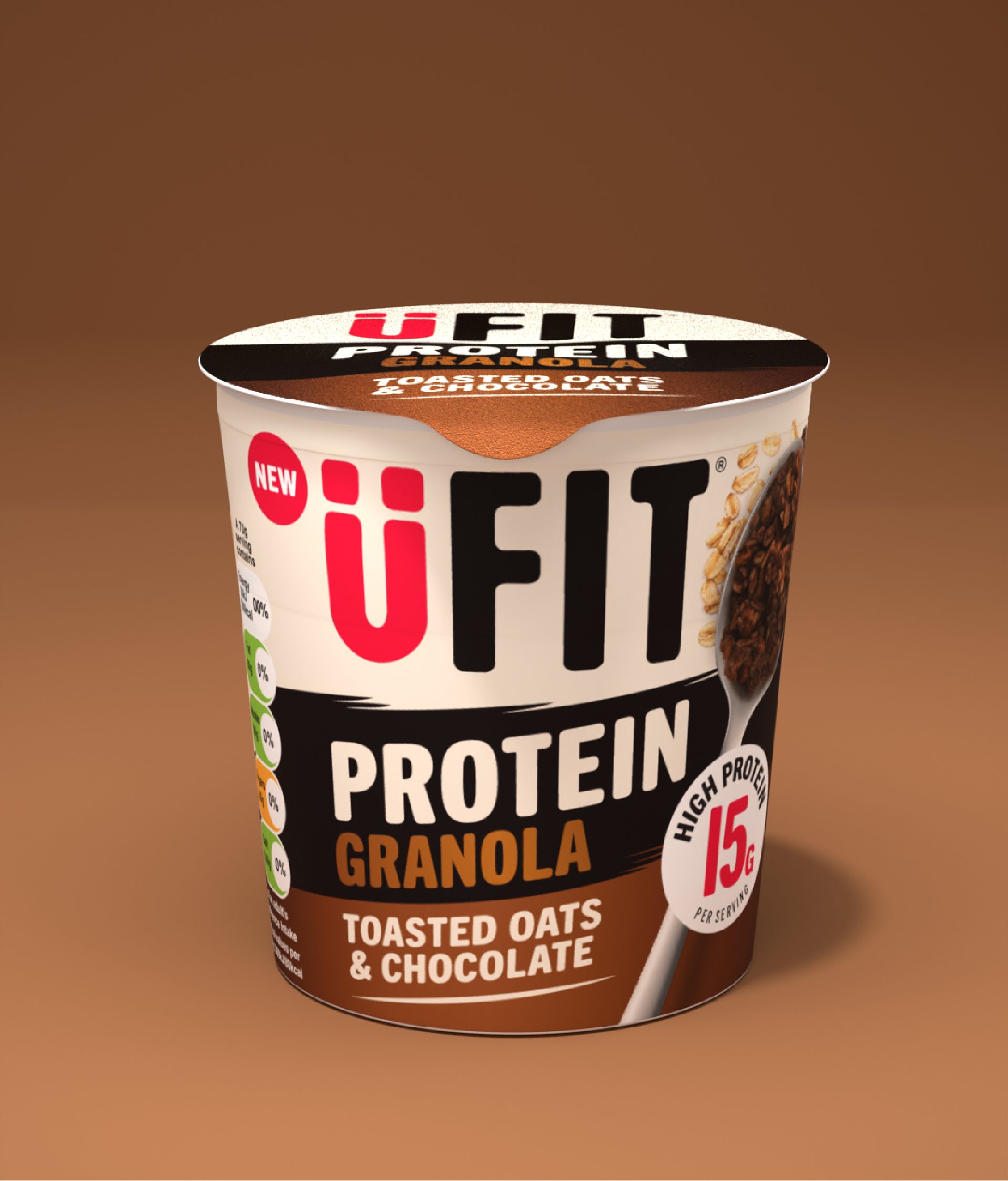
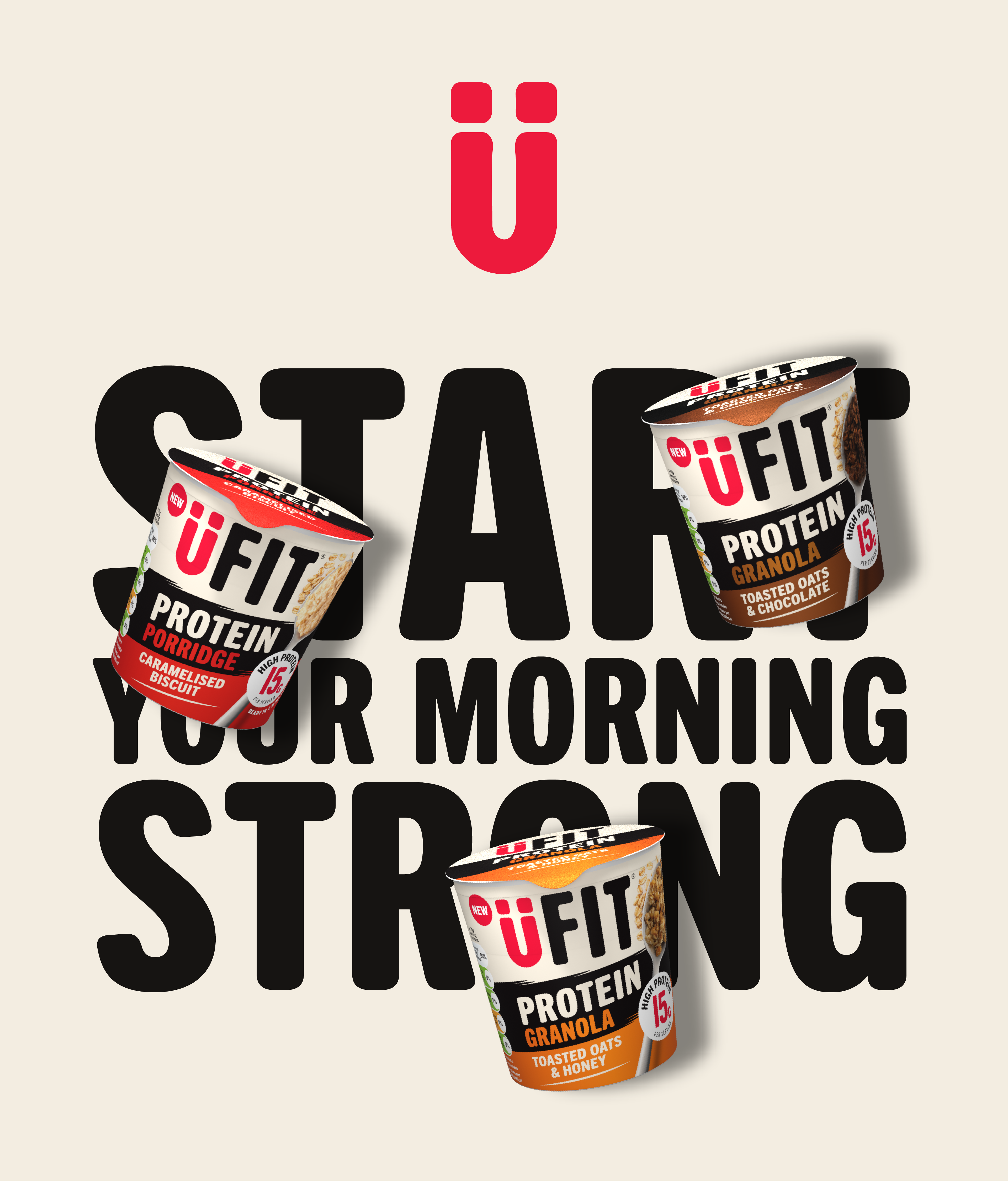
Hot on the heels of UFIT’s brand and packaging identity for its flagship protein drink, Cyon was invited by parent company Weetabix to extend the updated brand positioning into the breakfast aisle. With a product range including protein cereal, granola and porridge, UFIT needed packaging that delivered max shelf standout while staying true to its new ‘fuel good, feel good’ philosophy.

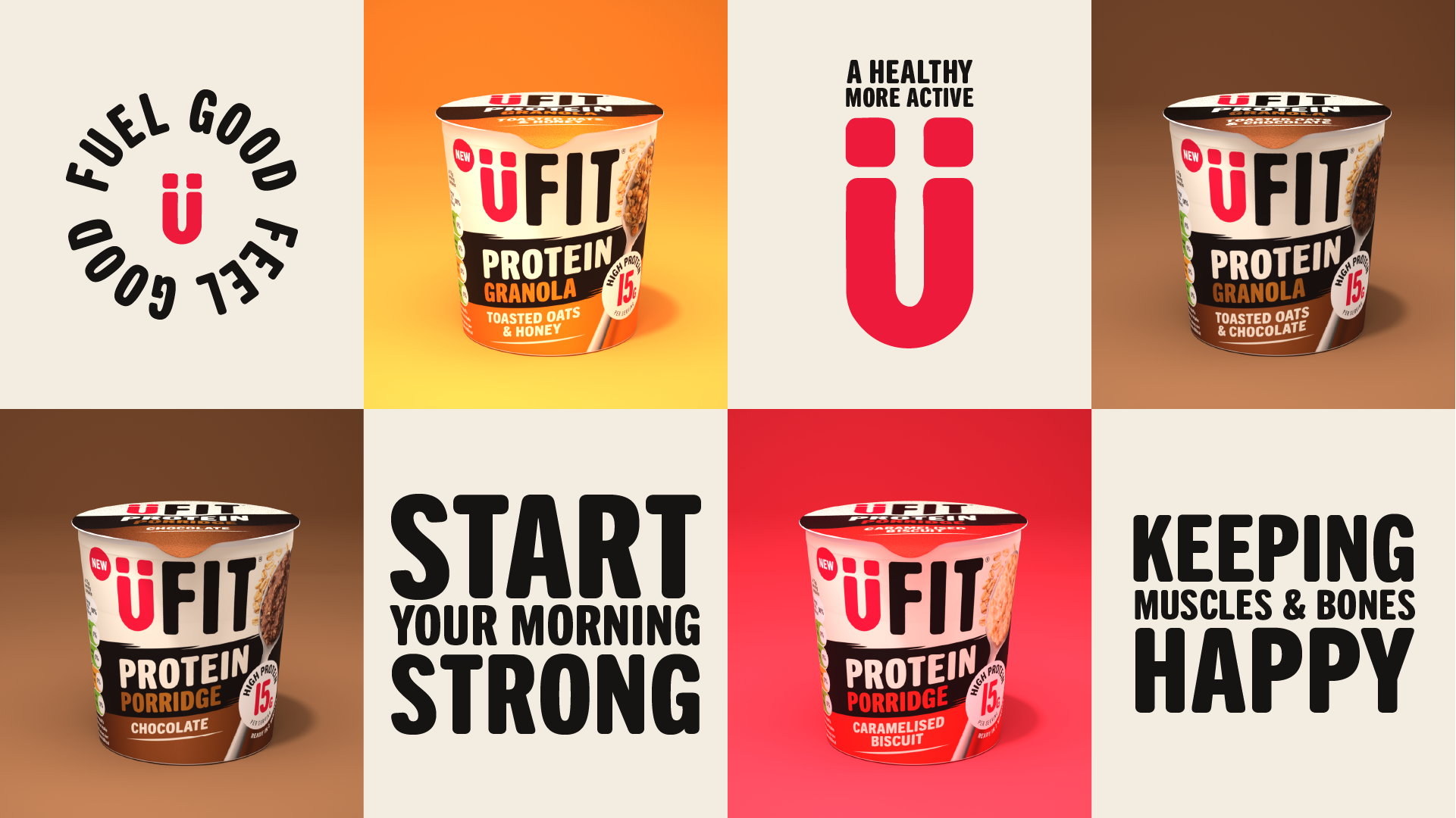
We get U
Having helped reposition UFIT as a brand for ‘every kind of doing’ through our protein shake range redesign, we were tasked by Weetabix to apply the same energy to UFIT’s growing breakfast offer. This collaboration required a creative solution that unified multiple product types under a single design system, while still allowing each to express its unique flavour, function and appeal.
Energy on shelf
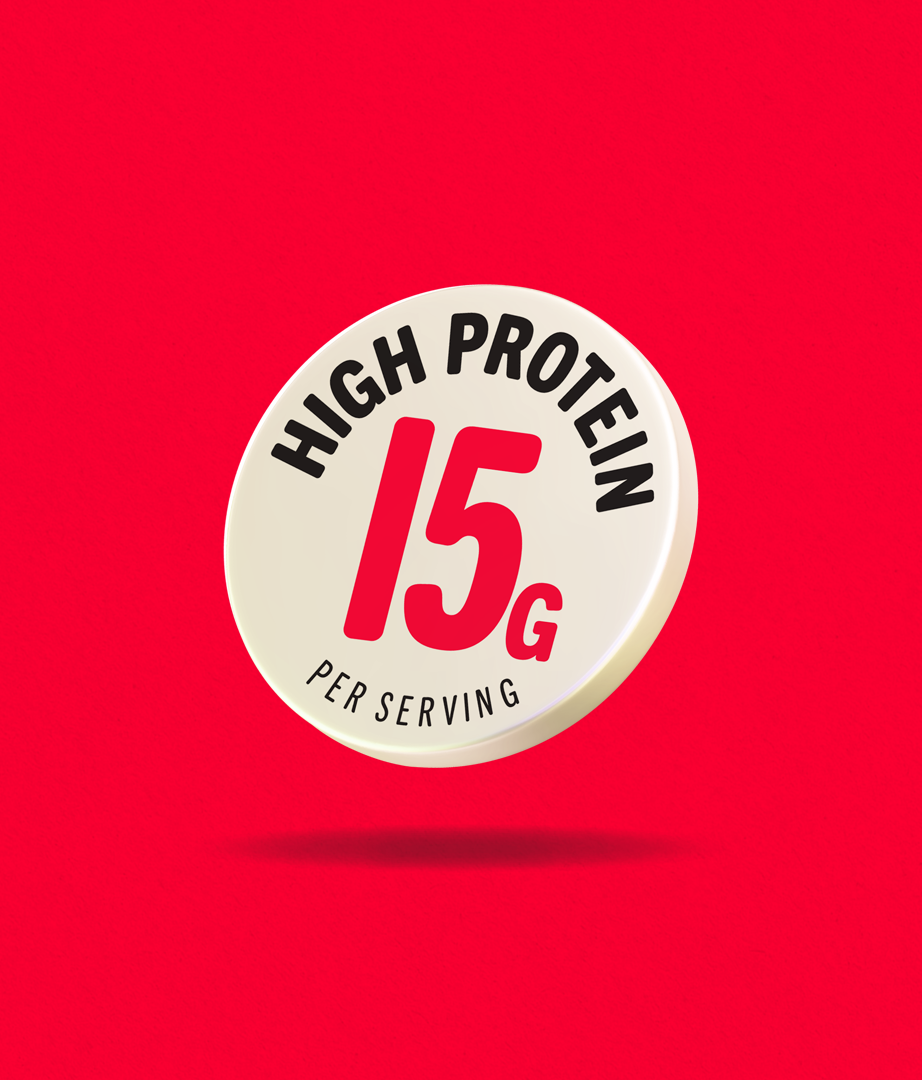
Big, bold and built to move. We used dynamic flashes and punchy typography to bring energy to every pack. The UFIT logo leads, loud and proud. We shot real ingredients to dial up flavour and keep things real. A bright, flavour-led colour palette ties it all together, flexing smoothly across boxes and grab-and-go pots.